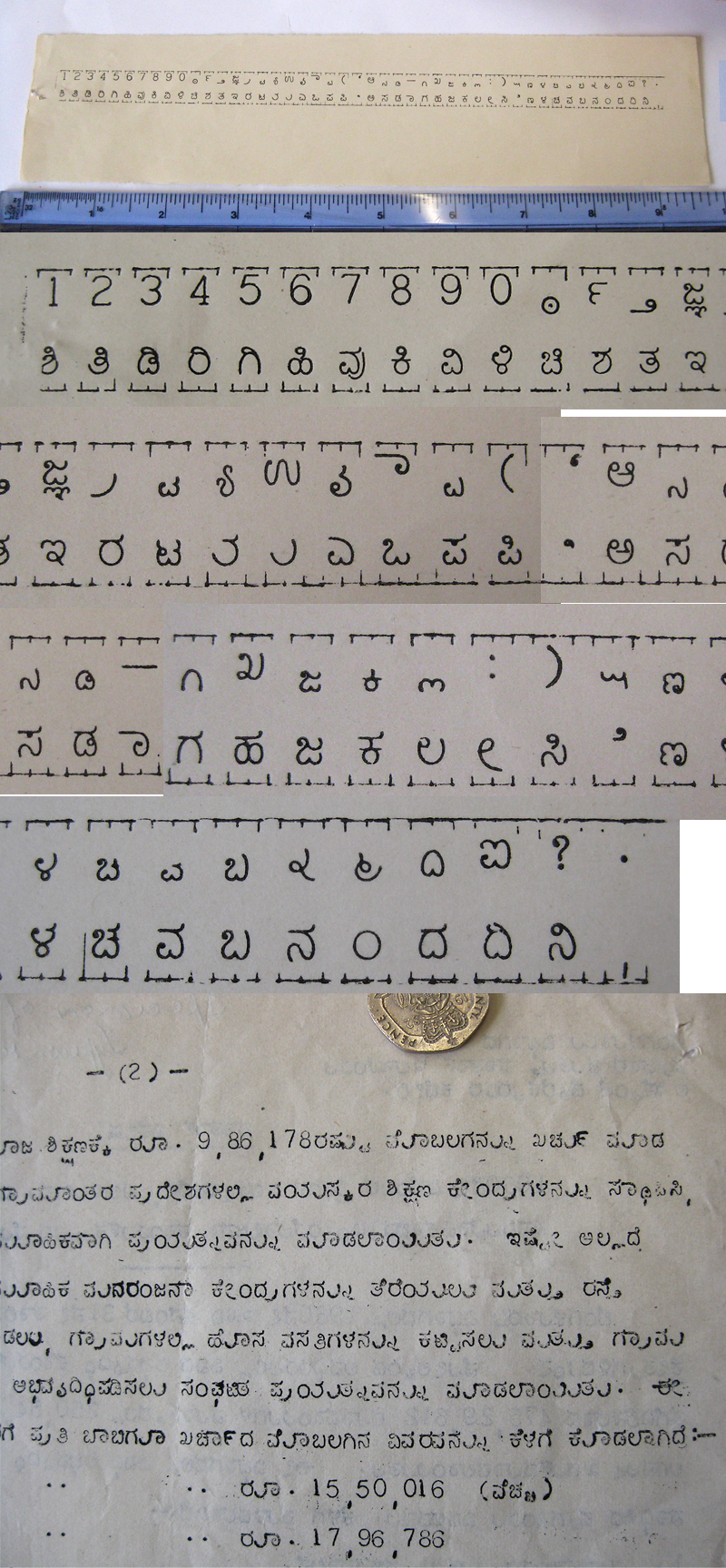
A design attributed to Mr. Anantha Subbarao, above is a sample imprint of a Kannada typewriter and a page of typed text from 1961.
Digging in the University of Reading collections, I found these in a box of correspondence between Linotype’s offices in Calcutta, Madras, and London, commissioning a new Kannada typeface. Monotype had recently finished a new Kannada design, causing Linotype to rush into making a competitor. Samples of Subbarao’s government-approved typewriter design, a newspaper clipping, and book were sent to the London office for them to get acquainted with – the author (R.J. Ceasar) warned how difficult it would be to design one!
Notice how large a gap there is between the characters and the “u” strokes! Tricky tricky to make a monospaced Kannada or Telugu! Also interesting, there are pre-made consonants + “i”, but to create the consonant + “aa” or consonant + “e”, a vowel character is just stamped on top of the base character, with the little top bar tail still visible! Haha! Do you see what I mean? Sorry, confusing, I know!
Dork notes: Also, at the end of the document, he says “Telugu is practically identical to Kannada, with the exception of five to six characters…” when describing a possible further order for the Andhra Government press. I have a lot more research to do, regarding the timing when Kannada and Telugu typefaces began using different dependent vowel marks and “tick marks” vs “head lines”, but this leads me to believe that maybe the differentiation happened even more recently than I thought! But more on that later…
If anyone’s interested in seeing the correspondence, email me or leave a comment!