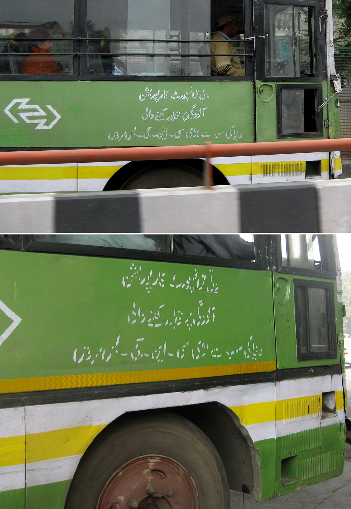
Photo taken: March 2011, New Delhi.
An easy and low-cost way to brand all of your bus company’s vehicles, or to post other mostly-permanent, repeatable information, is with a stencil. Stencilled type is always fascinating to me, especially when it seems that the creator of the stencil didn’t always choose their cuts and shapes with clarity in mind.
I snapped pictures of two different buses in New Delhi, both which used the same message, but a slightly different cut of the stencil. I bet you’ll agree that the letterforms of the top bus are much more clear than those on the bottom. Kind of fun to see what a difference the thickness and placement of a cut can make. In the bottom image, the positive and negative shapes begin to blend together, and it looks more like confetti! At least, to a non-native reader like me!

