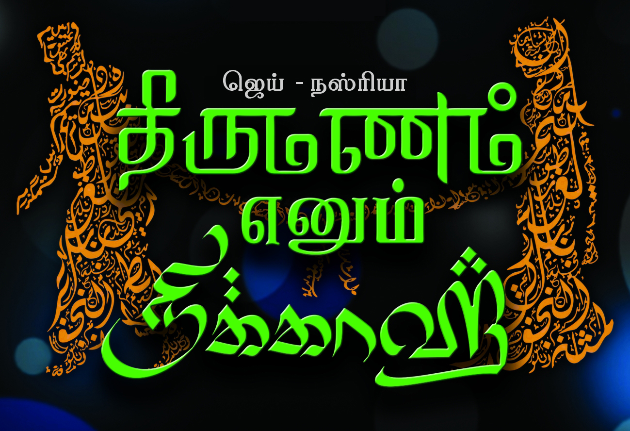
திருமணம் எனும் நிக்காஹ் (Thirumanam Ennum Nikkah)
I stumbled across this film title while searching for something totally unrelated, but I always love finding these weird script pastiche pieces. I thought that it was worth posting, as I know that “Latinisation” of non-Latin scripts (and vice-versa) is a hot-button issue for some folks 🙂 .
This is the titling for a 2014 Tamil movie centered around a popular theme in Indian cinema: falling in love with someone from a different (i.e. “wrong”) religion. Thirumanam is a Tamil Hindu word for marriage, Nikkah is an Islamic term for marriage.
To demonstrate this, the first line, திருமணம், is stylized to look like Devanagari (which, in many peoples’ minds, is associated with religious Sanskrit texts). Curves are straightened to give an implied “headline”, and to refer to the frequent verticals in Devanagari. The proportions of letters like ம are altered to look like they’re hanging (like ढ… actually, looks more Gurmukhi-style to me! ਫ). Not sure why they made the pulli a circle, though.
The third line, நிக்காஹ், is stylized to look like Arabic. A pen angle similar to that in Islamic calligraphy is used, heights are altered, reminiscent of Arabic proportions. Letter shapes are altered to look more like ق م ى etc. Pulli are stylized to look like different multi-dot ijam combinations.
The second line, எனும், is written in a more “neutral” Tamil style — or is it? 🙂 For the all-too-critical folks like me, I see it as a pastiche of Latin type, in which the curves of Tamil are forced to look like a rigid, high-contrast, seriffed Latin face.
Just for fun, here’s the Latin script version of the titling. (I’m not sure where/when/why this version was used):
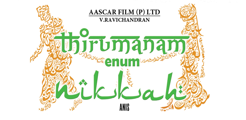
And, something I found to be funny: Notice that in these versions, the male and female figures are comprised of Arabic calligraphy, in the same manner as the amazing zoomorphic calligraphy tradition. Notice the difference in the graphics used on most of the movie advertisements I’ve found:
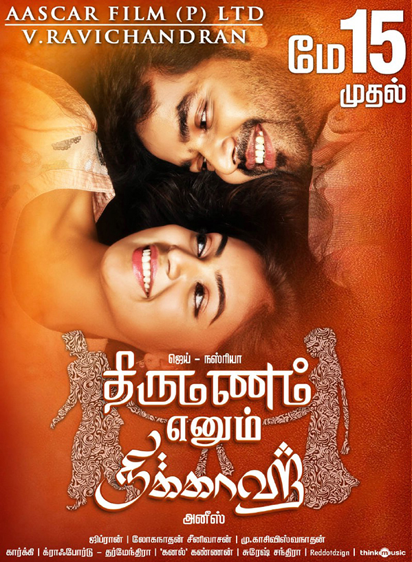
Gasp! Replaced by a clipping mask revealing a nondescript swirly pattern. Such a shame!