An interesting time capsule of typography, arkitekton has scanned a series of Sri Lankan Dinamina newspapers covering the 1969 lunar landing.
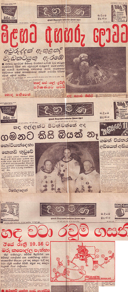
Monolinear display type, condensed and rounded display typefaces, “italic” slanted subheads, and the use of red and light blue ink in headlines, to create more differentiation. This looks to be the standard Monotype Sinhalese design.
(I need more time to study the Linotype and Monotype side-by-side to be sure! Let me know if you know!)
Comments
Hi Erin,
Thanks for sharing, very nice samples! Can’t say about the text face, because it’s too small, but regarding the display typefaces in red, it looks like they were produced by Robert DeLittle in the UK. Have a look at this thread on twitter: https://twitter.com/_rafaelsaraiva/status/570194563610124288
In the subheads, both slanted and upright typefaces have idiosyncratic features, such as the peculiar Virama, the curly exit stroke in “La” and the filled curved stroke for the “long u” vowel mark. This points to a particular design, different from the Monotype Series and Linotype design. There is a contemporary digital font called Dinamina, adapted/digitised in 2004, which has similar features.
Cheers!
Rafael
Wow!! Thanks so much for the info, Rafael! I hope to post more Sinhala images in the future – but unfortunately they are hard to come by in this part of the world 🙂